Making "Write with AI" Actually Usable

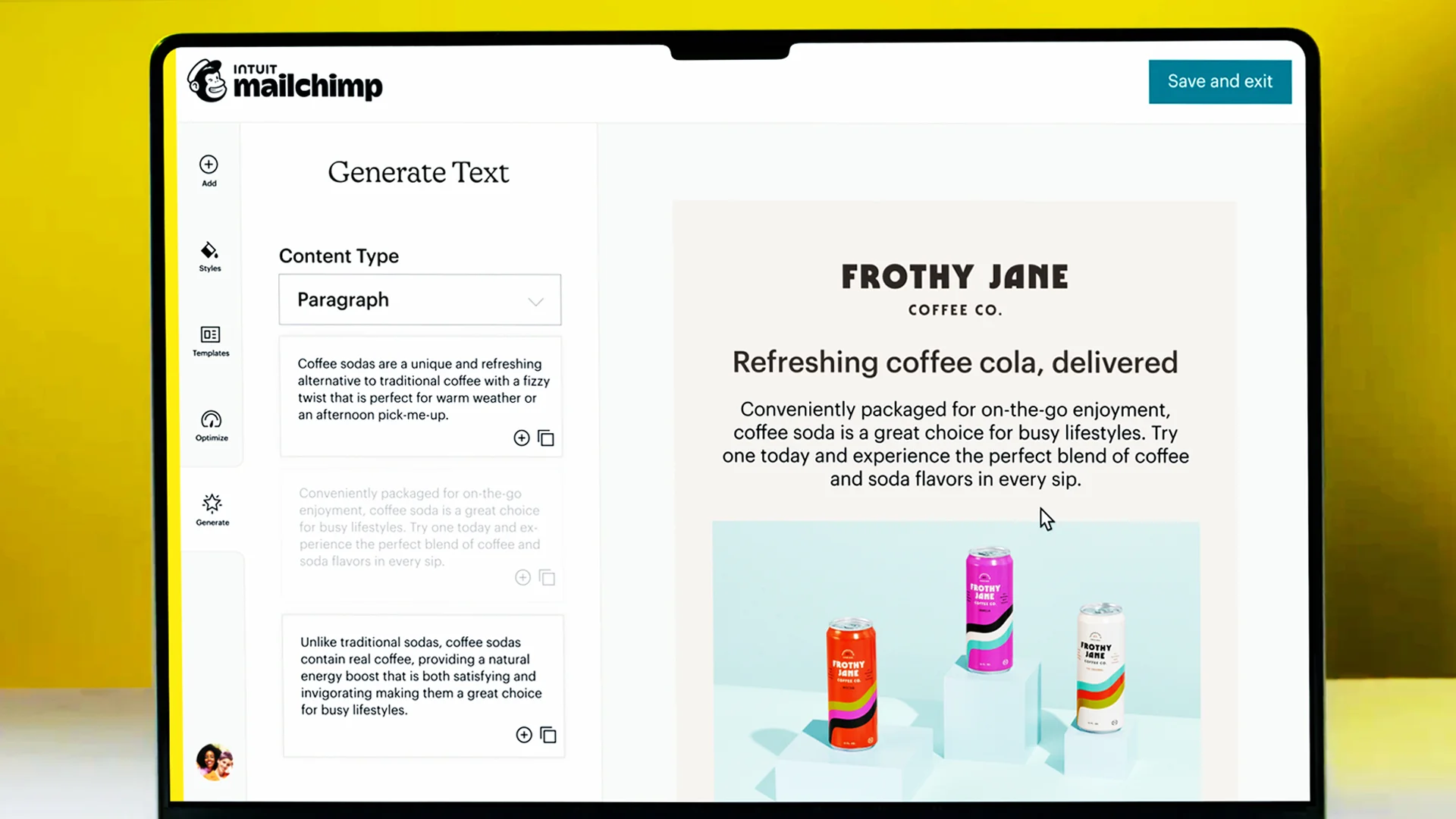
Mailchimp was preparing to launch an AI-powered content generation feature inside the email editor. I led usability testing to identify UX issues before release, uncovering interaction patterns that were confusing users and preventing them from getting value out of the tool.
RoleLead Researcher
TeamEmail team, Intuit Mailchimp
Timeline3 weeks
MethodModerated usability testing (n=12)

The TLDR;

Pre-launch usability testing of Mailchimp's inline AI content generation feature revealed that users couldn't distinguish between two competing text boxes on the page, didn't realize they could type their own prompts, and found the tone controls confusing because they appeared before the user had generated any content. The research led to shipped design changes including clearer affordances, an action-oriented CTA, and resequenced tone controls that matched users' mental models.

Impact

All three primary recommendations shipped. The text box affordances were redesigned to separate the two input areas. The CTA was rewritten to be specific and action-oriented. And the tone adjustment controls were moved to appear after content generation, aligning with how users actually think about refining copy. The research caught these issues before public launch, preventing a first impression that would have undermined trust in the AI feature.

Inline content generation interface

Why this research was needed

Mailchimp was building an AI-powered writing assistant directly into the email editor. The feature let users generate email marketing content from scratch using use case suggestions, type their own prompts, and rewrite existing copy by adjusting tone and length. Before shipping it broadly, the content generation team needed to identify key UX issues that could block adoption or erode trust in the feature.

This was an especially high-stakes launch because users' first interaction with AI-generated content would shape their long-term perception of the tool. If the interface was confusing or the output felt generic, users were unlikely to come back.

Methodology

I ran twelve one-hour moderated usability tests with marketers who were responsible for crafting email content. Users accessed the feature through a feature flag within their own Mailchimp accounts, which ensured they were interacting with real data and real workflows rather than a prototype.

I tested three distinct interaction flows: users' first impressions of the "Write with AI" pop-up, using AI to create content for common email use cases from scratch, and rewriting existing content using tone and length controls. I randomized the order of the tasks to avoid order effects.

Findings

Three core usability issues emerged from the testing sessions, each pointing to a gap between how the interface was structured and how users naturally think about AI-assisted writing.

Three core usability issues

Unclear Affordances

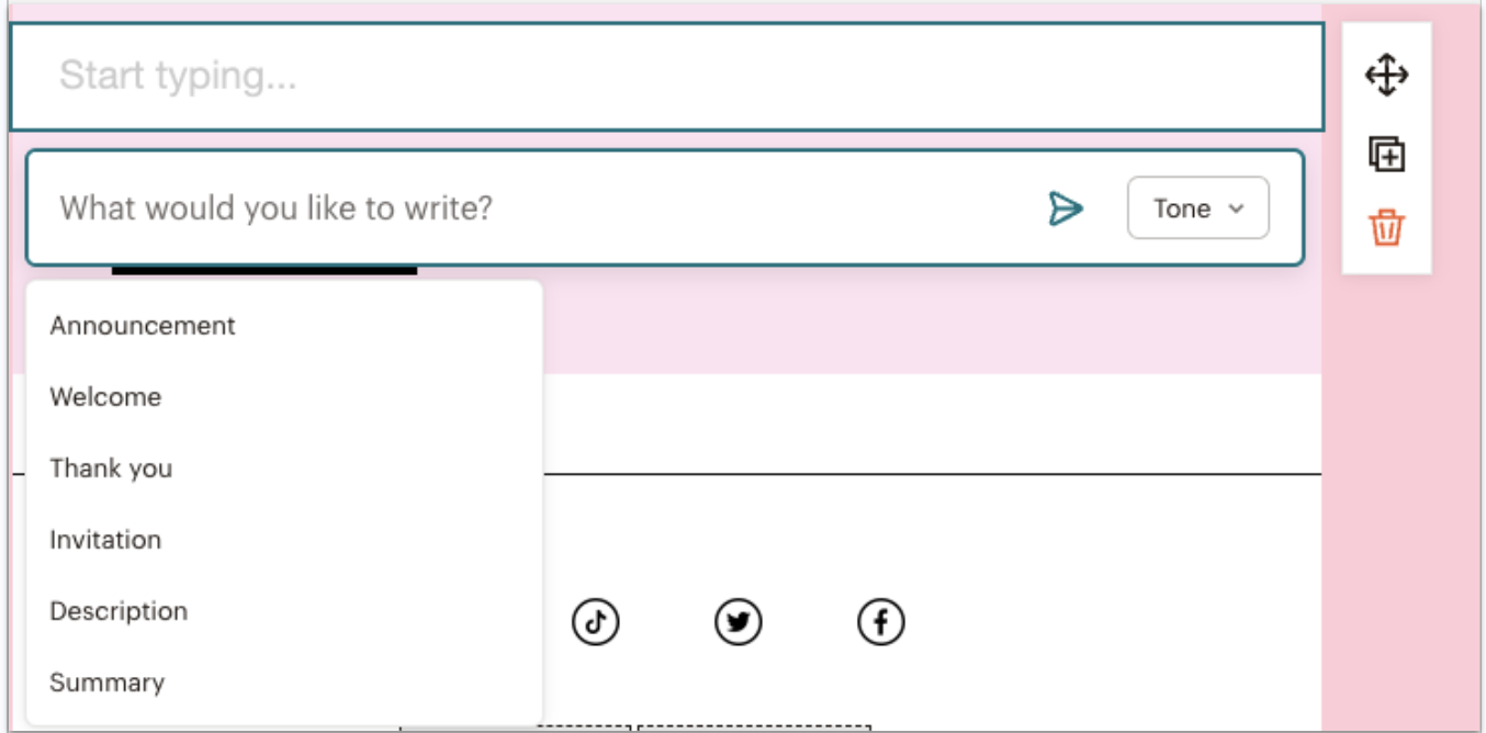
The interface had two text boxes side by side, and users were confused about which one to interact with. It wasn't apparent that they could type their own prompt. The tone dropdown appearing before the generate button made the interaction order unclear.

Unclear affordances screenshot

Tone Didn't Feel Authentic

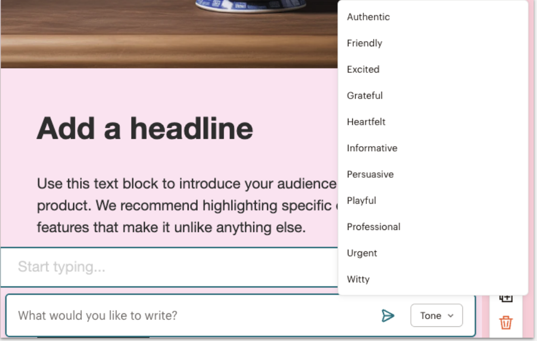
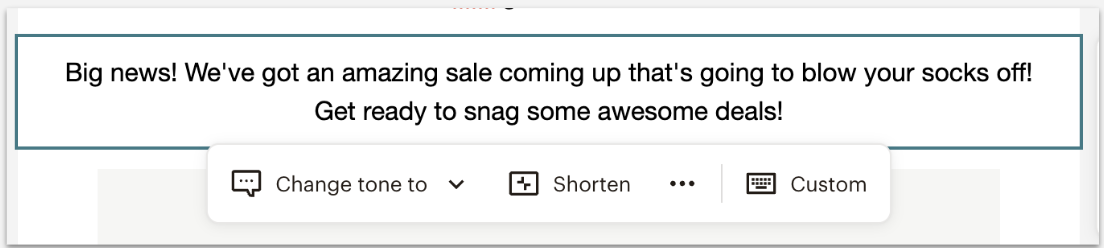
Users appreciated the tone options but weren't convinced the output reflected their choice. Some couldn't distinguish between tones that felt redundant (grateful vs. heartfelt, playful vs. witty), and others felt the generated copy simply didn't match. One participant put it well: "I might do it just to look for new ideas, or to correct my habits of writing. I would play with the tone just to see how it could be spat out differently, as opposed to using the same crutches that I rely on." The recommendation was to explore training the model on users' past emails to make tone feel more authentic and personalized to their brand voice, a finding that surfaced a longer-term product opportunity beyond the immediate UX fixes.

Tone not authentic screenshot

Use Cases: Good for Cold Starts Only

Most users appreciated use case suggestions because coming up with engaging content was the hardest part. But users who replicate existing emails didn't see themselves using them regularly. Valuable for cold starts, not habitual workflows.

What changed

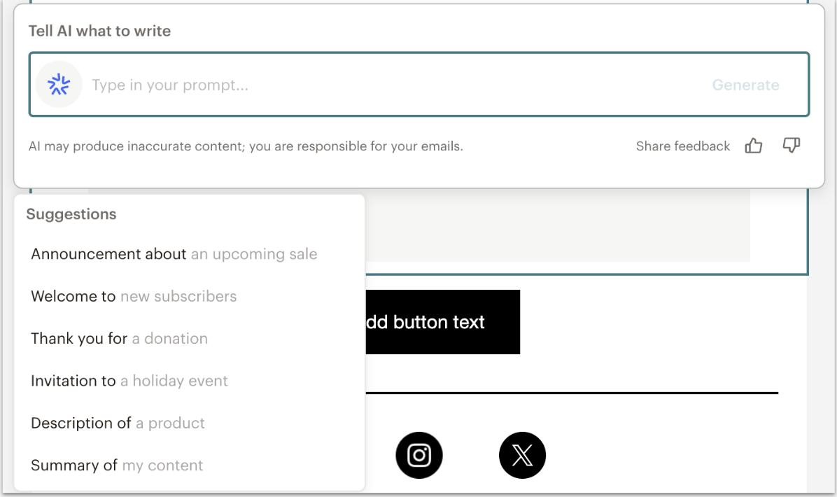
All primary recommendations shipped. The text box affordances were redesigned with added instructions on the second text box and visual indicators to break up the two input areas, making it clear how to interact with each one.
Outcome 1Unclear affordances

The CTA was changed to be specific and action-oriented, signaling that users could enter their own text rather than just selecting from suggestions. Additional detail was added to the suggestion options for inspiration.
Tone not authenticOutcome 2

The option to change tone was moved so it appears after the user has generated their copy, matching the natural workflow of generate first, then refine. This aligned the interface with users' mental model of how they approach AI-assisted writing.